Awards


Phillmic Investments
- No Website Available
- Phillmic Investments is a Zimbabwe-based carpentry and woodwork company founded in 2022 by Mike Musirinofa, serving clients in Gweru and Shurugwi. The company specializes in custom furniture, cabinetry and both residential and commercial carpentry solutions, delivering durable and high-quality workmanship with a strong focus on precision and craftsmanship. With a commitment to professionalism and client satisfaction, Phillmic Investments continues to build a reputation for reliable and innovative woodwork solutions tailored to modern needs. As part of its brand development, LogoCert supports Phillmic Investments through logo certification, branding support and secure logo archiving to ensure a consistent and protected visual identity.
Contact Details
- Phone number not available for public access maybe for privacy.
- Email not available for public acess maybe for privacy.
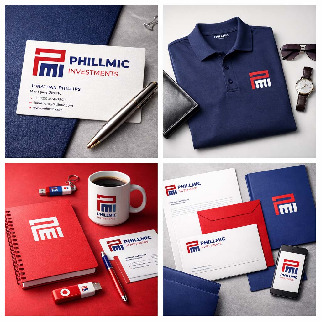
Mock up
Pattern
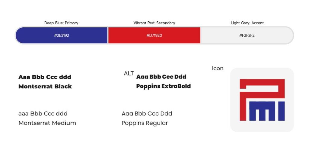
Colors & Fonts
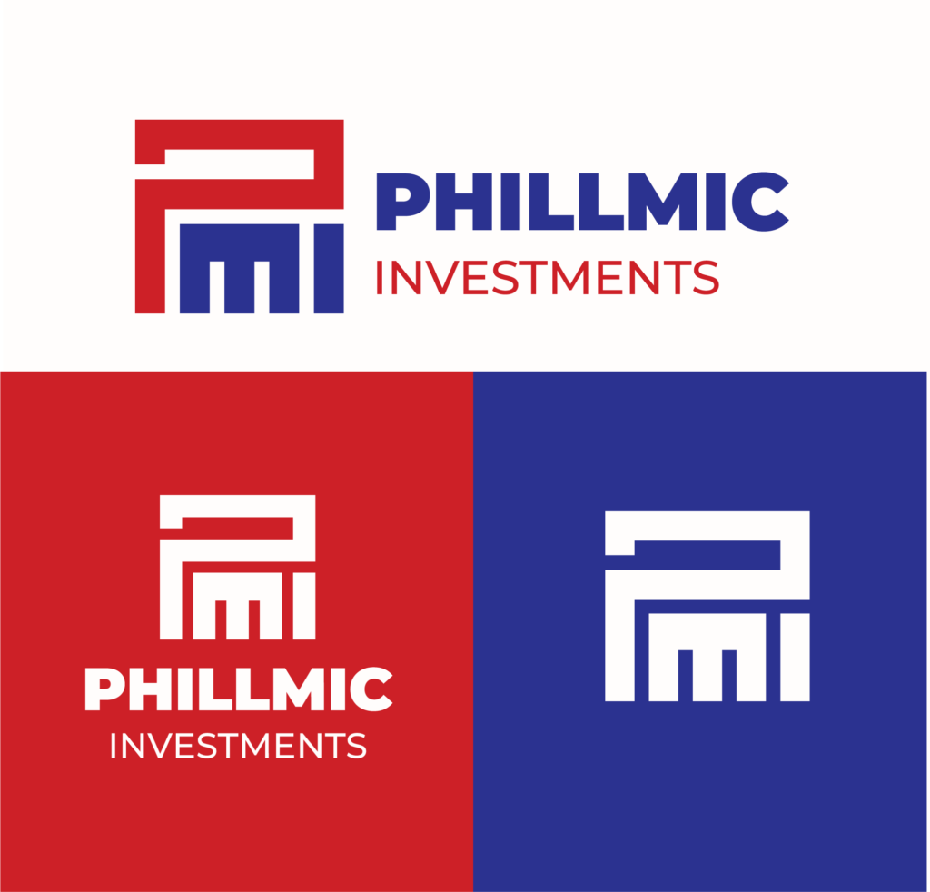
Logo Overview
As the designer behind the Phillmic Investments logo, I aimed to create a bold and memorable visual identity that reflects strength, structure and long-term growth. The core symbol is a custom-built monogram combining the letters “P”, “M”, and “I” into a unified architectural form. This geometric construction is intentionally inspired by carpentry and building frameworks, subtly referencing the company’s expertise in woodwork, custom carpentry and structural craftsmanship. The clean lines and balanced proportions communicate precision, reliability and professionalism, key qualities that define the brand’s approach to delivering high-quality carpentry services.
The typography is modern, bold and highly legible, reinforcing a sense of trust and clarity, important for a business operating in construction and custom woodworking solutions. The color palette of deep blue and vibrant red was carefully chosen to balance stability and energy. Blue represents trust, professionalism and long-term investment, while red adds strength, action and craftsmanship. The flexible layout system, seen in both light and dark variations, ensures the logo performs well across digital platforms, signage and marketing materials. Together, these elements create a strong brand identity that aligns with Phillmic Investments’ mission of delivering durable, high-quality carpentry solutions with precision and innovation
Phillmic Logo markup