
Awards


Warrender Heights
- No Website Available
- Warrender Heights is a premium residential development brand inspired by elevated living, modern comfort, and lasting value. LogoCert helps document, certify, and archive the visual identity of Warrender Heights, preserving its commitment to quality and elegance.
Contact Details
- Phone number not available for public access maybe for privacy.
- Email not available for public acess maybe for privacy.
Mock up
Pattern
Colors & Fonts
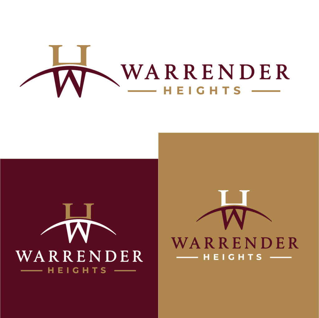
Logo Overview
The design for the Warrender Heights logo is a harmonious blend of sophistication and modernity, embodying the brand’s commitment to elevated living. The stylized initials ‘H’ and ‘W’, crafted in a way that suggests both stability and grace, are positioned above the elegant typeface of ‘WARRANDER HEIGHTS’. This layout not only draws attention to the brand’s name but also creates a sense of upward movement, symbolizing growth and aspiration. The use of a deep maroon paired with luxurious gold accents speaks to the prestige and quality that homeowners can expect in this exclusive residential development.
Incorporating negative space creatively, the logo’s design subtly hints at an arc above the initials, reminiscent of a welcoming horizon symbolizing the serene atmosphere and the promise of an upscale lifestyle. The choice of typography reflects both modernity and elegance, making the overall composition not just visually appealing but deeply meaningful, representing a refined address that residents can proudly call home.
Warrender Heights Logo