Awards


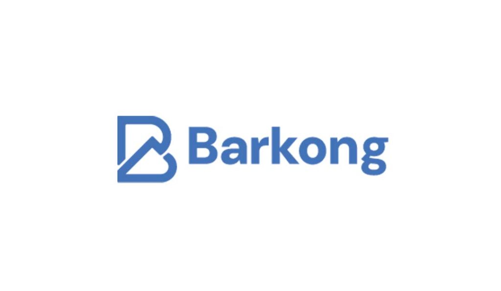
Barkong Logo
- No Website Available
- Barkong Investments is a Gweru-based company founded by Thulani Ncube in 2025, specializing in the manufacturing of IBR roofing, Iron sheets, and innovative construction solutions. The company is committed to delivering reliable products for contractors, government projects, and businesses, with plans to expand into sewing uniforms, transport, and agri-chain services. With a strong focus on quality and future growth, Barkong’s brand identity is supported by LogoCert, providing trusted logo certification, branding expertise, and secure archiving for a professional image that stands out in Zimbabwe’s competitive construction industry.
Contact Details
- Phone number not available for public access maybe for privacy.
- Email not available for public acess maybe for privacy.
Mock up

Pattern

Colors & Fonts

Logo Overview
When I designed the Barkong Investments logo, my goal was to create a modern brand mark that instantly communicates what the company stands for. The core of the design is a bold, geometric “B” that cleverly integrates an upward arrow—deliberately shaped to resemble a roof. This visual cue connects directly to Barkong’s main business of manufacturing IBR roofing and Ion Sheets, making the logo instantly relevant to construction and building solutions. The upward flow of the roof also hints at growth and progress, showing Barkong’s vision for expansion into new industries like sewing, transport, and agriculture.
For the wordmark, I used a strong, clean sans-serif typeface to ensure the brand feels approachable yet solid, reflecting reliability and quality. The striking blue color palette was chosen to symbolize trust, professionalism, and modernity, while the simple, uncluttered layout makes the logo adaptable for products, business cards, vehicles, or digital platforms. Altogether, these elements create a brand identity that feels purposeful and future-focused—perfect for a company that aims to lead in both construction and broader business ventures in Zimbabwe.
Barkong Logo


