Awards


Prockim Cleaning Company
- No Website Available
- Cellphone Industries is a technology-focused business specializing in mobile phone sales and repair services designed to keep people connected in today’s digital world. The company provides a range of solutions including smartphone sales, professional phone repairs, mobile accessories, and device unlocking services for everyday users, students, businesses, and technology enthusiasts. The brand’s identity and logo are professionally documented through LogoCert, which supports businesses with logo certification, branding support, and secure logo archiving to protect and strengthen their visual identity.
Contact Details
- Phone number not available for public access maybe for privacy.
- Email not available for public acess maybe for privacy.
Mock up

Pattern

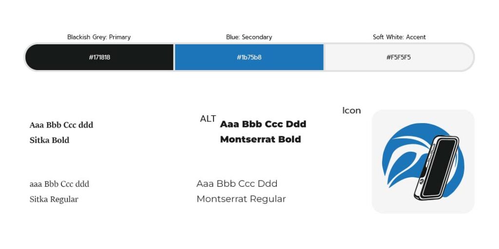
Colors & Fonts
Logo Overview
The Cellphone Industries Zimbabwe logo was created to visually communicate innovation, reliability, and the essential role mobile technology plays in modern communication. The smartphone icon is the central symbol because it directly represents the core of the company’s industry. By placing the phone within a circular graphic element, the design reflects continuous connection, network coverage, and the idea of communication that moves beyond borders. The flowing curves within the circle also symbolize signal waves and technological progress, reinforcing the company’s mission to support communication and digital growth within Zimbabwe’s mobile technology market.
The typography was intentionally designed to be bold, modern, and highly readable to reflect strength and professionalism. Using uppercase lettering helps the brand appear confident and established while keeping the name easy to recognize across different platforms. The blue color palette was selected because blue is widely associated with trust, technology, and reliability. Altogether, the design represents a modern mobile technology brand focused on innovation, connectivity, and dependable service.
Cellphone Industries Zimbabwe Logo