Awards


Genzell Mining Pvt Ltd
- No Website Available
- Genzell Mining Pvt Ltd is a Zimbabwe-based mining company specializing in mineral extraction, drilling, and site development. Built on a foundation of strength, precision, and operational efficiency, the company is dedicated to delivering reliable solutions for resource exploration and excavation projects. With a focus on modern techniques and consistent performance, Genzell Mining supports industrial growth and infrastructure development across the region. Through professional branding support and logo certification services, LogoCert helps preserve and strengthen the company’s visual identity for long-term recognition and trust.
Contact Details
- Phone number not available for public access maybe for privacy.
- Email not available for public acess maybe for privacy.
Mock up
Pattern
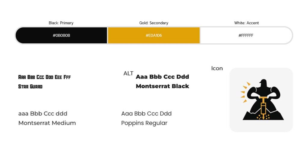
Colors & Fonts
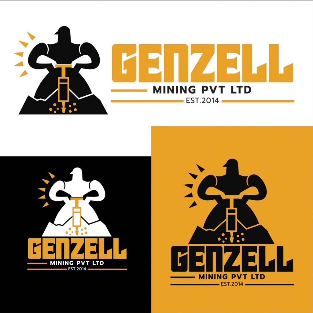
Logo Overview
I designed this logo to embody strength, precision, and industrial power. The central symbol features a bold, stylized figure operating a jackhammer, carved in a minimal yet impactful silhouette. This represents human effort, resilience, and the core activity of mining. The angular mountain base reinforces the idea of excavation and natural resources, while the small fragmented shapes beneath the drill suggest active extraction. The use of sharp geometric forms keeps the design modern and authoritative, ensuring it communicates both reliability and efficiency.
The color palette combines a deep charcoal grey with a strong industrial gold. Grey conveys stability, professionalism, and machinery, while gold reflects value, resources, and success, perfectly aligning with the mining industry. The typography is bold and structured, with slightly customized letterforms to create a distinctive identity for “GENZELL.” The extended layout version balances the icon and wordmark for flexibility across applications, while the stacked version emphasizes the emblem’s power. Overall, the design communicates a company that is grounded, hardworking, and focused on delivering high-value results.
GENZELL Logo LockUp